LUNETTES SELECTION SUMMER SALE

On Sunday, 25th of August, our favorite Berlin glasses brand and client Lunettes has its summer sale and we made some flyers and posters for them.
Browse a huge selection of vintage frames, sunglasses and Lunettes Kollektion sample pieces at discounts of up to 80%.
Sunday, 25th of August
Torstr. 172, Berlin-Mitte, 11-19h
www.lunettes-selection.de

FASHION WEEK INTERNATIONALE

Mostly, I am not a big fan of VICE Magazine, but the Vice TV productions sometimes are very recommendable. Berlin Fashion Week started today, but you might be interested in how the same event is celebrated in cities that don’t get as much attention as Paris, Milano or New York. In the series Fashion Week Internationale, journalist and ex model Charlet Duboc travels to e.g. Seoul, Jamaica, Tel Aviv and Nigeria and digs deeper into the countries’ culture, ideals of beauty and societal challenges. Find all episodes here or just search on Youtube.
PANEL DISCUSSION AT EPILOG 2013


On the occasion of Lette Verein‘s graduation exhibit »EPILOG« we are taking part in a panel discussion this Wednesday. Together with our team from Œ Magazine we will talk about how to work across disciplines like photography, fashion and graphic design.
Everybody is welcome to drop by for the exhibition’s finissage at Industriehalle / Schindler Campus on 12th of June – the talk will start at 5 p.m.
Images: Jannis Hell

2013 BOOK FAIR IN LEIPZIG
ARTIST OPERATED AUCTION HOUSE


Örnsbergsauktionen is the name of an artist operated auction house for studio produced, independent design and craft. Its creators, Fredrik Paulsen, Simon Klenell and Kristoffer Sundin, were missing a platform for contemporary, unique design in Stockholm so they initiated the first Örnsbergsauktionen during Stockholm Design Week 2012. The idea of the auction is to open up the process between idea and finished product and to reduce the distance between designer and client. Now time has come for the second edition – until February, 8th you can check out and bid on a range of beautiful and somewhat crazy objects, bypassing the commercial demands of mass production!
Sculpture by Sara Lundkvist | Glasses by Silo Studio | Tray by August Sörenson | Necklace by Maria E Harrysson
Images: Viktor Sjödin


AUGUSTIN TEBOUL AT BERLIN FASHION WEEK


Once more Berlin Fashion Week came and went; but some impressions are still lingering on. Like the presentation by Augustin Teboul, atmospherically illuminated by a wonderfully warm and bright light concept. The collection is black and dominated by intricate lace and crochet elements. As usual, you might say, but experts agreed upon a progress in Augustin Teboul’s work which in this collection became evident in more graphical and ethnical elements. Check out for yourselves here!


PANTONE COLOUR OF THE YEAR 2013


Harmony, balance and clarity – these sound like good principles for the new year, right? At least this is what the Pantone Color Institute promises us when they announce Emerald as the colour of the year 2013. “Emerald is a lively, radiant, lush, vivid, verdant green which brings a sense of clarity, renewal and rejuvenation, which is so important in today’s complex world”, comments Leatrice Eiseman, Pantone’s executive director. Last year’s Tangerine Tango had some impact in the fashion and beauty world – let’s see if we are going to paint our nails emerald green by the end of this year!

CUBAN POSTER ART - THE NEW GENERATION


The team behind German typography and graphic design magazine Slanted discovered the amazing power of Cuban poster art and is planning on a special issue to give the Cuban artists an international voice. With 320 pages this Slanted issue will have an impressive coverage and exhibitions in Berlin, Leipzig and Paris will give deeper insights into Cuban design.
To make all these great plans reality, Slanted is dependent on the support of all you design enthusiasts out there: Via crowdfunding you can support the project by ordering copies in advance or buying hand-pressed prints signed by the artists. You can find the latest info on the project’s Facebook page.

TIMELESS BEAUTY - 100 YEARS OF FASHION PHOTOGRAPHY EXHIBITION


When American publishing house Condé Nast opens its archives in New York, Paris, London and Milan for the first time you can be sure to see some of the world’s finest fashion photography! To be honest we even expected a more daring selection but nevertheless some real treasures could be found. Especially seeing the classic compositions of photography’s old masters such as Edward Steichen was truly amazing. In many images you see that fashion photography reflects the respective era, society and zeitgeist and does not just tell us about timeless beauty, as the exhibition’s title might suggest.


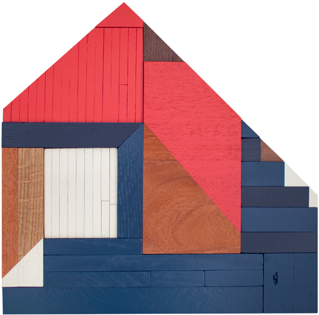
CABIN STUDIES BY DREW TYNDELL


Like father, like son. Drew Tyndell, an artist working in Atlanta, Georgia, started out with graffiti, but his latest series of work clearly shows that growing up with an architect father has influenced him. Using different sized pieces of wood, Drew creates studies of beach and cabin homes. Impressive how the colours and structures add depth and a third dimension to the artworks. Check here for more variations!


100 BEST POSTERS OF THE YEAR


What started out already in 1966 as a competition for the best posters in the GDR has become a dear recurring event: The exhibition »Die 100 besten Plakate des Jahres« (100 Best Posters of the Year) is once more on display at Kulturforum at Potsdamer Platz. 53 posters from Germany, 45 from Switzerland and 2 from Austria were awarded for their outstanding design, whereof 23 of the prize-winning entries are posters designed by students.
We were great fans of the posters by the following designers: Paula Troxler for a Moby Dick theater play, Valeria Gordeew for a masked ball at Udk Berlin, Markwald & Neusitzer for an exhibition of islandic artist erró, Björn-Christian Schiebe for the Museum of Natural Sciences.
Have a look at all winning posters here or check other dates of the travelling exhibition.


SARAH ILLENBERGER EXIBITION AT VOO STORE


We went out to see Sarah Illenbergers exhibition at voo store in Kreuzberg. Some of the exhibits apparently were done just at the same day but a lot of her work was familiar. Nevertheless it was nice to see some of the originals and the beetroot diamonds, the pomegranate and the blonde apple just made us smile!


COVER ART: »COUNTRY FAIR«
PANTONE COLOUR OF THE YEAR 2012

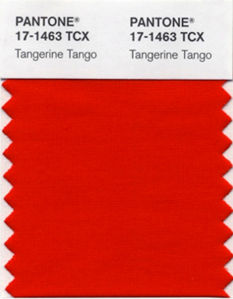
After this year’s honeysuckle, the Pantone Color Institute has named »Tangerine Tango«, a radiant reddish orange, as the colour of the year 2012. As the emotional state and economic climate worldwide still are somewhat depressed, the colour is supposed to ”provide the energy boost we need to recharge and move forward”, as the Institute explains its decision. So let’s see where we come across this vibrant colour during the next months!
Pantone’s last years’ choices were Honeysuckle, Turquoise, Mimosa and Blue Iris.

PAPER SCULPTURES BY NICK GEORGIOU


As sad as this sounds, as beautiful is the work of artist Nick Georgiou. And here‘s what he says about it: “My art is inspired by the death of the printed word. Books and newspapers are becoming artifacts of the 21st century. As a society we’re shifting away from print consumption and heading straight towards full digital lives. My sculptures are products of their environment —both literally and figuratively. As often as I can, I use local newspapers to add authenticity, and the form the sculpture takes is a reflection of the personal connection I feel to that particular city.”


