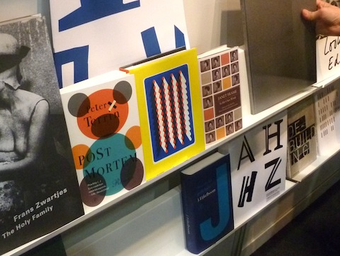
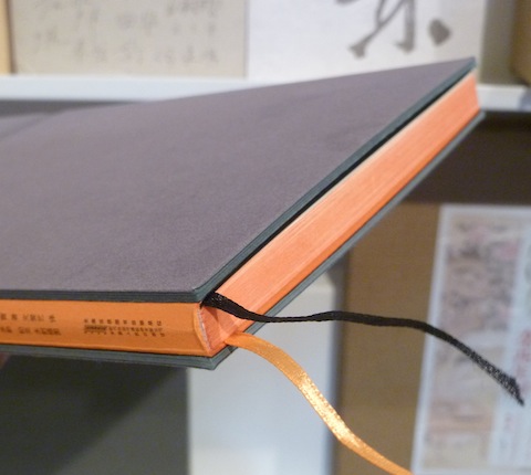
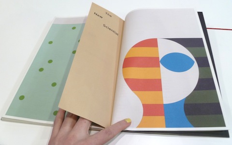
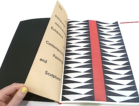
2013 BOOK FAIR IN LEIPZIG
ARTIST OPERATED AUCTION HOUSE


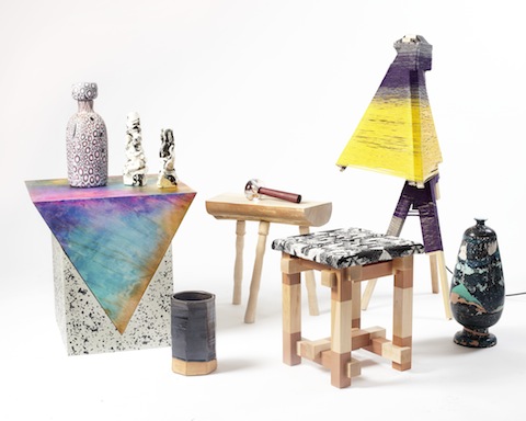
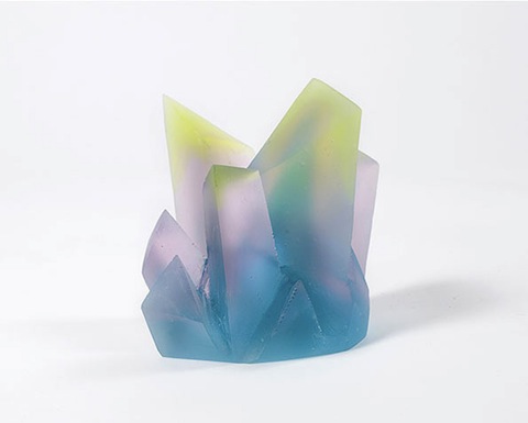
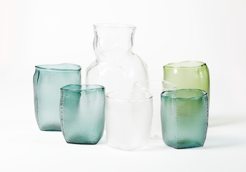
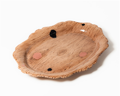
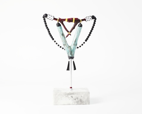
Örnsbergsauktionen is the name of an artist operated auction house for studio produced, independent design and craft. Its creators, Fredrik Paulsen, Simon Klenell and Kristoffer Sundin, were missing a platform for contemporary, unique design in Stockholm so they initiated the first Örnsbergsauktionen during Stockholm Design Week 2012. The idea of the auction is to open up the process between idea and finished product and to reduce the distance between designer and client. Now time has come for the second edition – until February, 8th you can check out and bid on a range of beautiful and somewhat crazy objects, bypassing the commercial demands of mass production!
Sculpture by Sara Lundkvist | Glasses by Silo Studio | Tray by August Sörenson | Necklace by Maria E Harrysson
Images: Viktor Sjödin


PANTONE COLOUR OF THE YEAR 2013


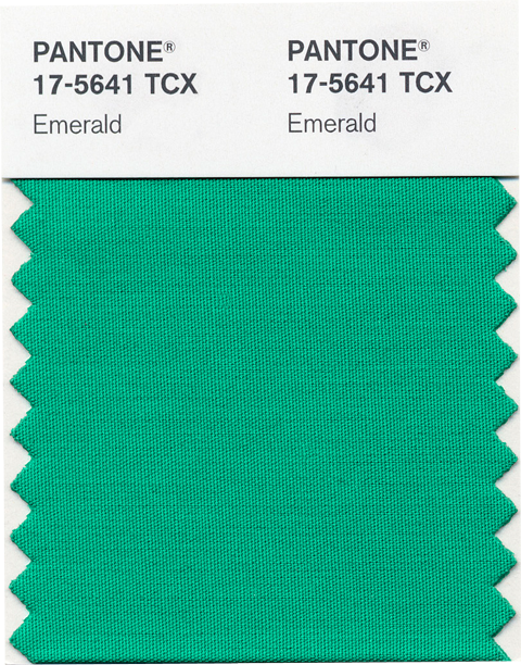
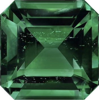
Harmony, balance and clarity – these sound like good principles for the new year, right? At least this is what the Pantone Color Institute promises us when they announce Emerald as the colour of the year 2013. “Emerald is a lively, radiant, lush, vivid, verdant green which brings a sense of clarity, renewal and rejuvenation, which is so important in today’s complex world”, comments Leatrice Eiseman, Pantone’s executive director. Last year’s Tangerine Tango had some impact in the fashion and beauty world – let’s see if we are going to paint our nails emerald green by the end of this year!

CUBAN POSTER ART - THE NEW GENERATION


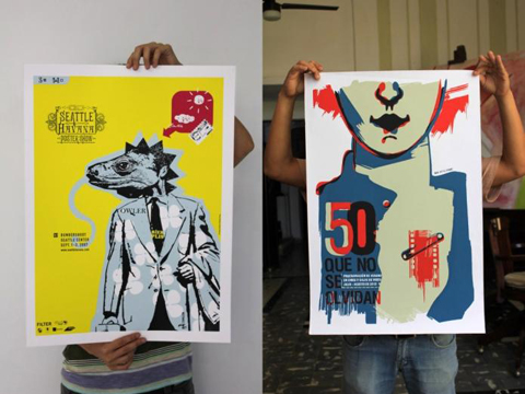
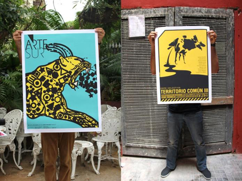
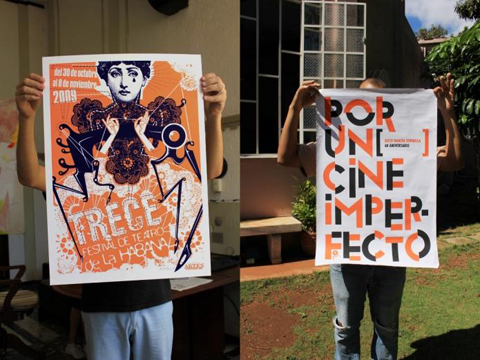
The team behind German typography and graphic design magazine Slanted discovered the amazing power of Cuban poster art and is planning on a special issue to give the Cuban artists an international voice. With 320 pages this Slanted issue will have an impressive coverage and exhibitions in Berlin, Leipzig and Paris will give deeper insights into Cuban design.
To make all these great plans reality, Slanted is dependent on the support of all you design enthusiasts out there: Via crowdfunding you can support the project by ordering copies in advance or buying hand-pressed prints signed by the artists. You can find the latest info on the project’s Facebook page.

100 BEST POSTERS OF THE YEAR


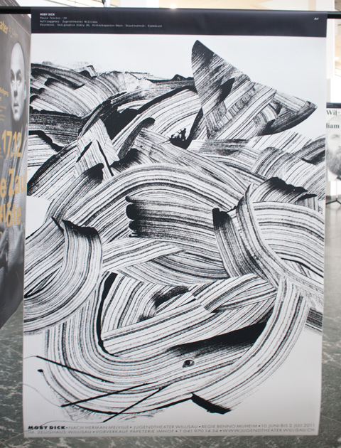
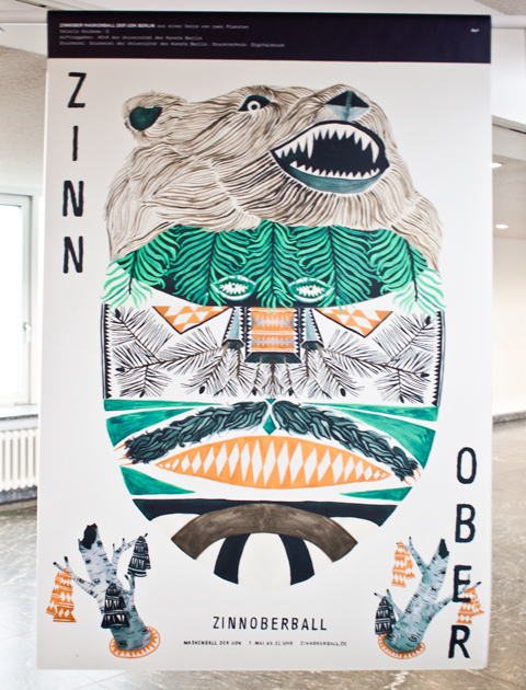
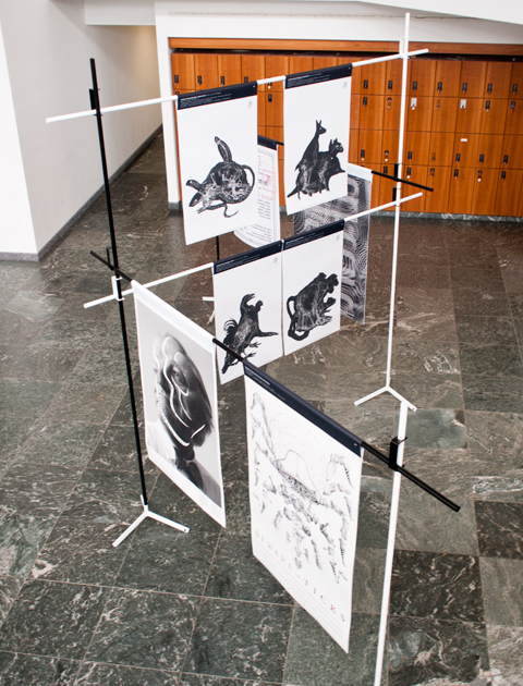
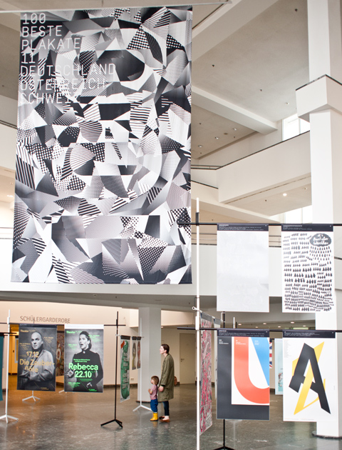
What started out already in 1966 as a competition for the best posters in the GDR has become a dear recurring event: The exhibition »Die 100 besten Plakate des Jahres« (100 Best Posters of the Year) is once more on display at Kulturforum at Potsdamer Platz. 53 posters from Germany, 45 from Switzerland and 2 from Austria were awarded for their outstanding design, whereof 23 of the prize-winning entries are posters designed by students.
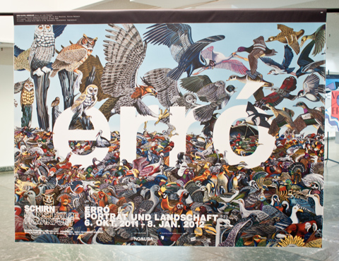
We were great fans of the posters by the following designers: Paula Troxler for a Moby Dick theater play, Valeria Gordeew for a masked ball at Udk Berlin, Markwald & Neusitzer for an exhibition of islandic artist erró, Björn-Christian Schiebe for the Museum of Natural Sciences.
Have a look at all winning posters here or check other dates of the travelling exhibition.


SARAH ILLENBERGER EXIBITION AT VOO STORE


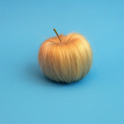
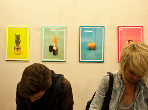
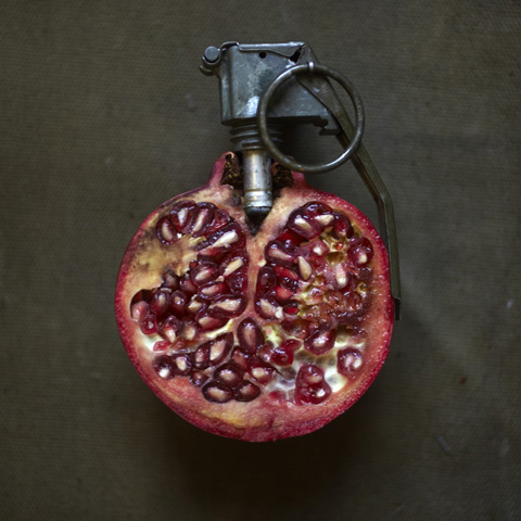
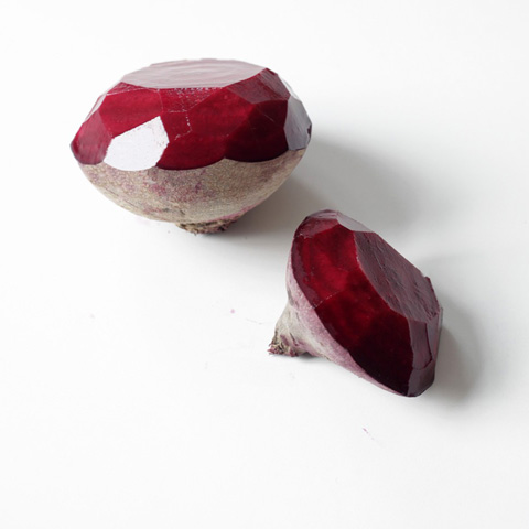
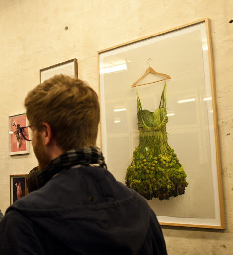
We went out to see Sarah Illenbergers exhibition at voo store in Kreuzberg. Some of the exhibits apparently were done just at the same day but a lot of her work was familiar. Nevertheless it was nice to see some of the originals and the beetroot diamonds, the pomegranate and the blonde apple just made us smile!


BOESSERT/SCHORN WEBSITE ONLINE


The website we designed for one of our favourite Berlin fashion designers Sonia Boessert of Boessert/Schorn is now online! The design process was a little accidental: the grey patchwork-pattern in the background originally was composed to visualize a grid system we wanted to lay behind everything and fill with different content and images. It happend that Sonia liked it so much that she wanted it to actually be the design for her website. And as client is king we implemented this idea.

TEMPORARY GLORY ATTRACTION LOGO + FLYER + POSTER


…and we gave it an outfit to get started on its way through Berlin’s nightlife.
Flyers and posters for the Grand Opening of the TGA party series have just arrived. The opening will take place on 2 of july, 2011:
19-22h Exclusive Barbecue Dinner on the Terrace of Bethanien
(rsvp: lamansarde@hotmail.de)
Pianoconcert by PETER LUDWIG BEIERLEIN, „All On Me“ Fashionperformance by KRIWO (Paris),
Magic Wood Visuals by MELLA OJEDA
Dancefloor: JUSTUS KÖHNKE, JULI HOLZ live, BONNIE, MS ELBE, BUGGY, TDAANCE
…and NO, we have not had enough of triangles yet!


BCP AWARDS: COVER OF THE YEAR 2011

For the second time Corbis awarded a prize for the best cover in corporate publishing media at BCP. We are really happy that our cover for »The Romantic Issue« of Electronic Beats Magazine won this special prize! The image of the romantic German shepherd was shot by Mikael Kennedy. »The cover is the perfect adaption of this issues’ topic romanticism. A strong and exceptional image that intentionally breaks with the viewing habits of its target group, the ‘Digital Natives’.« Yay! Photographer: Mikael Kennedy / Art Direction: Lisa Borges / Editor-in-Chief: Viktoria Pelles / Publisher: Commandante

DESIGN EXHIBITION DMY 2011
PRE-OPENING GESTALTEN SPACE


This was long overdue: Berlin-based publishing house Gestalten finally opened a shop/exhibition space! But the waiting was worth the while: Situated in Sophie-Gips-Höfe in Mitte, »Gestalten Space« spreads over more than 300 square metres and offers all the great books by Gestalten, covering everything relevant in the international design scene. Besides, you can buy selected products by designers & artists who have been previously published by Gestalten. The gallery space is inaugerated with the exhibition »Cutters Edges« displaying contemporary collages by 50 international artists.


LEIPZIG BOOK FAIR SHOWS BEST BOOK DESIGN
CROWDFUNDING »OE MAGAZINE«


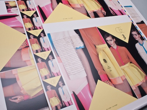
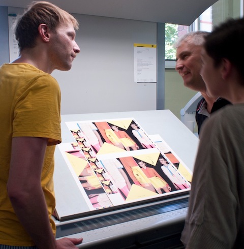
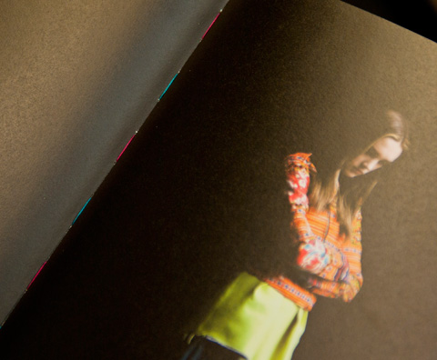
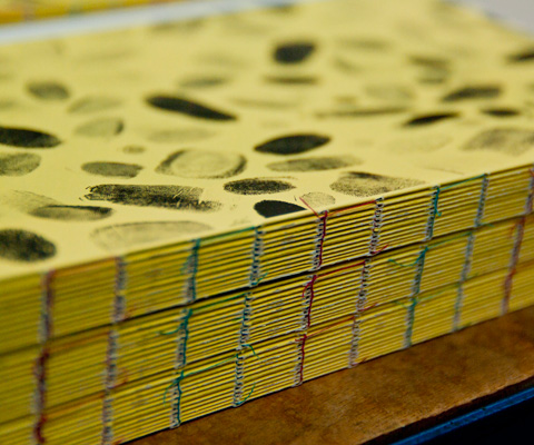
Together with more than 30 photographers, stylists, hair & make-up artists and models we were part of a fun project during the last weeks. We took care of the visual concept and layout of »Œ Magazine«, which is a new fashion magazine that focuses on Berlin’s fashion scene. The magazine is non-commercial and is in parts financed by crowdfunding. Check out the project’s campaign video here on WeFund and if you like it, feel free to support a good cause!
Contributing photographers: Amos Fricke, Dirk Merten, Lars Borges, Christoph Schemel, Andreas Lux, Jochen Arndt, Rachel de Joode, Clément Martz
Contributing stylists: Christian Stemmler, Christof Post, Rainer Metz, Åsa Lundström, Brenda Barr, Antje Gohlke, MAVEN, Julian Zigerli
Contributing hair & make-up artists: Alexander Soltermann, Henriette Höft, Manuela Kopp, Miriam Jochims


TYPOGRAPHY IN THE 20TH CENTURY IN EUROPE AND THE USA


The exhibition »Welt aus Schrift« (translated as “World as Words”) at Kulturforum on Potsdamer Platz takes you on a journey through the development of typography during the 20th century. Posters, books, magazines, invitations, stationery, restaurant menues, shop signs… there are so many places where typography becomes a part of our every day life. Here more than 600 of such examples are on display which outstandingly represent the style of their time and revolutionary turning points. A lot of interesting details are to be explored and inspiring styles to be found and it is amazing that many designs still feel very modern. For all of you that cannot come to Berlin until the 16th of January, there is a catalogue which includes almost all exhibits as well as some deepening essays.


