OENCE AGAIN…

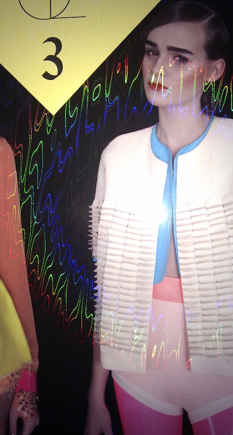
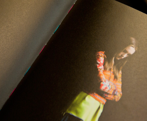
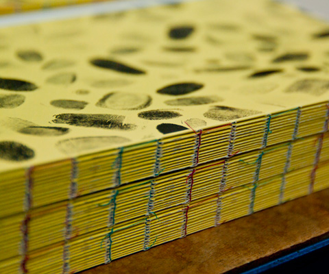
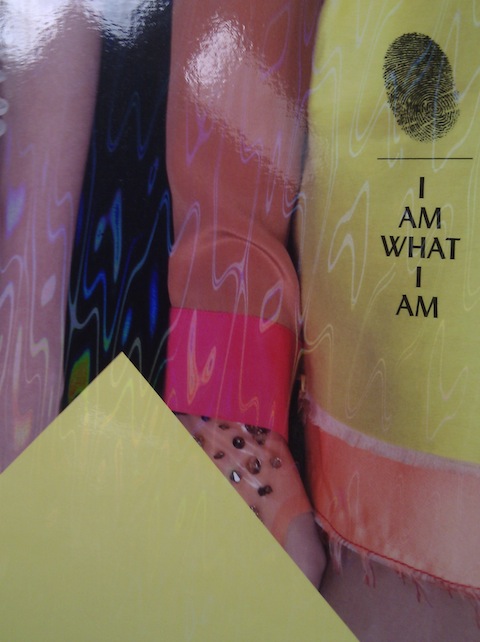
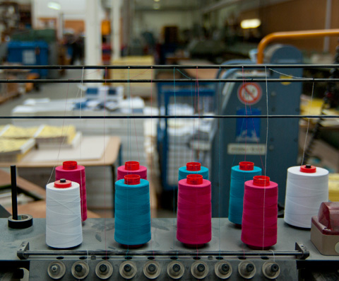
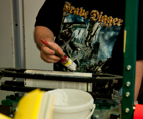
Yes, time is flying and once again we present the next issue of Œ Magazine. Eleven different paper qualities, an open-stitched binding in two colours and as the icing on the cake a holographic diffraction foil on the cover, we can’t ask for more! Surpassing the everyday standards in production, we are happy to work with experts Heenemann Druck and bookbinder Reinhart & Wasser. Production nerds, please enjoy some images of printing, binding and finishing!


FRESH FROM THE PRINTERS

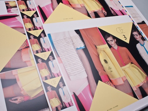
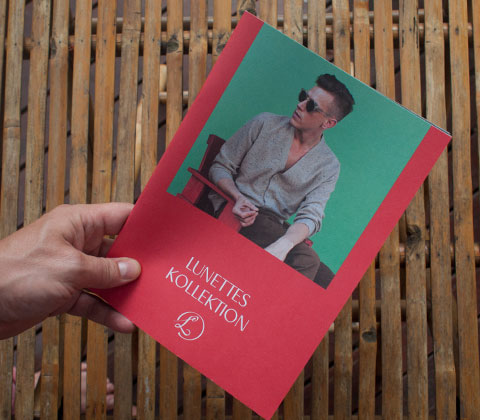
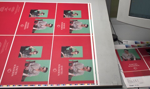
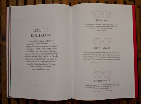
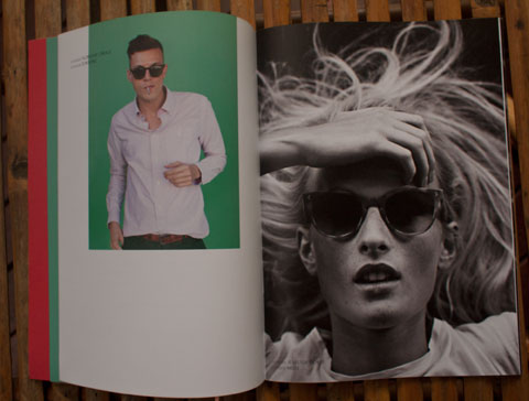
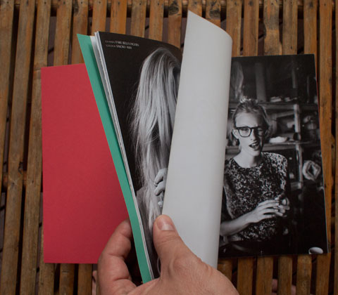
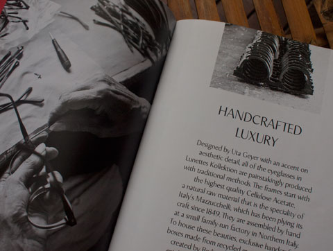
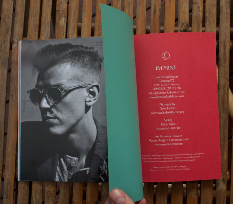
Right in time for Berlin Fashion Week, the lookbook we designed for eyewear label Lunettes Kollektion arrived from the printers. Great glasses, perfect models, beautiful photos shot by David Fischer and styled by Rainer Metz … a welcome dash of colour in Berlin’s grey weather. Check out the new Lunettes collection at the Collect Showroom!


PRINTING!

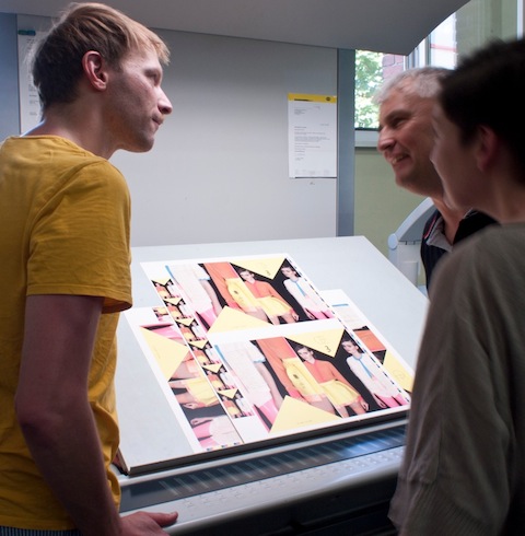
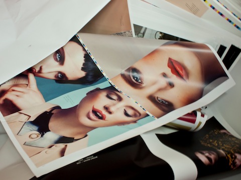
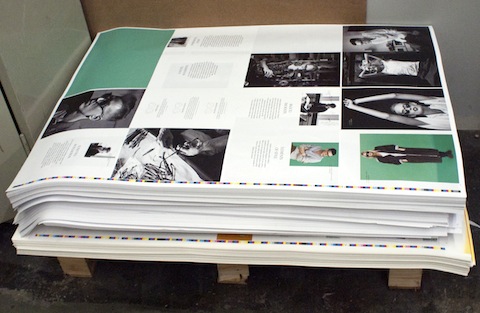
We´re just back from the press proof of the second issue of Œ magazine. It´s printed at printing house Heenemann and we´re very satisfied with what we saw. We can´t wait until it returns from the bookbinder! The images show contributions by Yves Borgwardt, Rachel de Joode, Jette Stolte and Jan Mielke,  for a copy and a list of all contributors check out www.oe-magazine.de. The issue will be out on November 18th.

PATCHWORK/ TEAMWORK

The website we designed for one of our favourite Berlin fashion designers Sonia Boessert of Boessert/Schorn is now online! The design process was a little accidental: the grey patchwork-pattern in the background originally was composed to visualize a grid system we wanted to lay behind everything and fill with different content and images. It happend that Sonia liked it so much that she wanted it to actually be the design for her website. And as client is king we implemented this idea.

ZWERGENGOLD

This is the CI we developed for and together with our friend Hanna Pordzik, who designs the most amazing things for her new jewellery label. Now we are convinced that Pantone metallic colours can look great on uncoated paper!

EARTHLY POWERS – POLLYESTER LIVE

The next flyer we did for TGA is announcing the show of allrounder and power woman Polina Lapkovskaja and her partner – come and see on thursday, 28th july 2011 at Bethanien!

A NEW BERLIN-PARTY-BABY IS BORN…

…and we gave it an outfit to get started on its way through Berlin’s nightlife.

Flyers and posters for the Grand Opening of the TGA party series have just arrived. The opening will take place on 2 of july, 2011:

19-22h Exclusive Barbecue Dinner on the Terrace of Bethanien
(rsvp: lamansarde@hotmail.de)
Pianoconcert by PETER LUDWIG BEIERLEIN, „All On Me“ Fashionperformance by KRIWO (Paris),
Magic Wood Visuals by MELLA OJEDA
Dancefloor: JUSTUS KÖHNKE, JULI HOLZ live, BONNIE, MS ELBE, BUGGY, TDAANCE

…and NO, we have not had enough of triangles yet!


CHEERS!

It’s been a while since we designed this wine etiquette for our client Achteinhalb. So it was a nice surprise when the final product was delivered by a messenger today.
Achteinhalb has a great collaboration with German vinegrower Tesch and they get their own bottling once in a while. For this 2009 Riesling we finally adapted the new Achteinhalb Corporate Identity to the label. It integrates nicely with the black bottles and of course the honorable Mr. Tesch himself!

MISSION COMPLETED


We´re happy to finally hold it in our hands, Berlin say hello to a new magazine which is dedicated to your vivid and complex fashion scene! Instead of trying to describe what’s going on fashionwise in our capital, we thought we’d better just show it! 10 fashion editorials present different facets with their pure images. Designwise we worked with a lot of paper qualities for the spreads, to enhance their look with a matching feel. A big thanks to Arne who initiated Œ Magazine and all the people who helped us with the financing part. Check out all participating photographers, stylists and hair & make-up artists here. We look forward to working on Œ number 2!

UPDATE: If you want to see ΠMagazine on TV click here!


COLOUR MATTERS

We helped a Berlin-based group of architects with developing their brand and created a corporate identity. We chose to work with colours, something rather unusual amongst architects. We wanted to match the fresh attitude of the architects in question but most importantly we needed a way to make a clear distinction between the members of S3A, who not always act as a group but also as individual service providers.

ACHTEINHALB


Thanks to ACHTEINHALB for the great opening! We were also exited to see the new visual identity we designed for them applied in the store.


CORPORATE CONSTRUCTION


To promote the »Bildungsmeile Wutzkyallee« we dyed building bricks in the corporate colors and initiated great building activities with children at the school fair together with empirica.


IDENTITY FOR EDUCATION COLLABORATION


»Bildungsmeile Wutzkyallee« is a collaboration of six educational institutions in Berlin Neukölln. Now the first applications of the CI we developed for the Bildungsmeile start to drop in. Amongst others we did a spontaneous photoshoot with children of Martin-Lichtenstein primary school – school can be fun!


WWW.FLUTER.DE


Not the easiest task to redesign www.fluter.de, the magazine of the Federal Agency for Civic Education (Bundeszentrale für politische Bildung) since it´s really content-heavy and has grown over the last 8 years. We had to clean up and restructure quite a bit to achieve a straight layout. It was a fruitful coproduction with Redaktion und Alltag who are still working on technical improvements and we are happy that the beta-version is finally online.