BOOOOOOKS

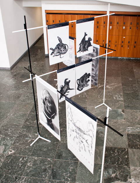
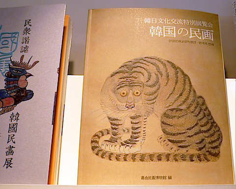
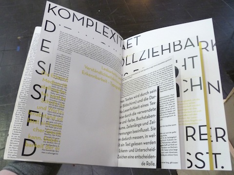
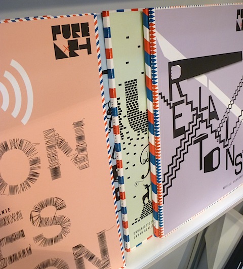
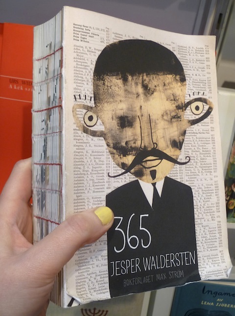
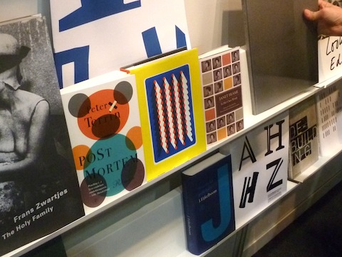
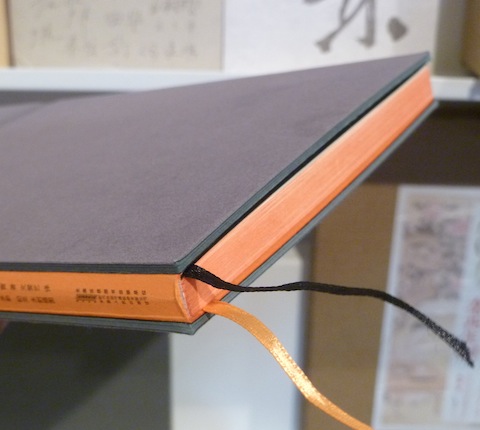
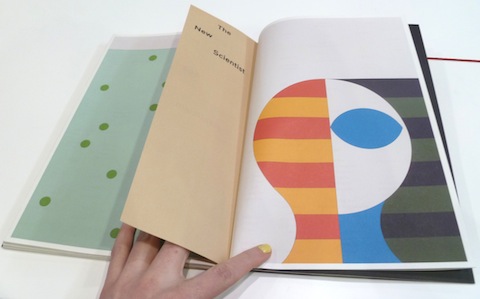
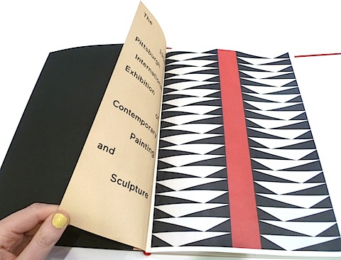
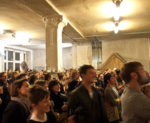
It is on the day one year ago that I wrote about the book fair in Leipzig and also this year I saw a bunch of inspiring books there – content-wise as well as regarding the design and production.  I spent hours admiring the nominees and winners of the yearly award »Best Book Design From All Over The World« and the presentations of the students of different German book art study programmes, find some impressions in the pictures. Another highlight was the Korean Pavillon – every single book here could have won the best book award, in my opinion!
I concluded my weekend in Leipzig with a visit to »It’s a book, it’s a stage, it’s a public space«,  a meeting of small independent publishers, where I met friends who presented their cool project »Publishing as (part time) practice«. Check it out here, I heard they will come to Berlin with it, soon.

Support Slanted #21

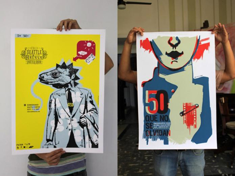
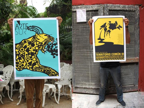
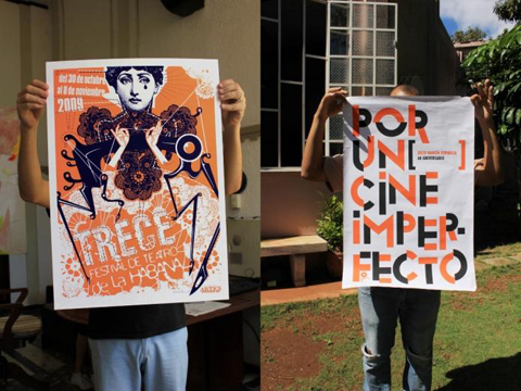
The team behind German typography and graphic design magazine Slanted discovered the amazing power of Cuban poster art and is planning on a special issue to give the Cuban artists an international voice. With 320 pages this Slanted issue will have an impressive coverage and exhibitions in Berlin, Leipzig and Paris will give deeper insights into Cuban design.
To make all these great plans reality, Slanted is dependent on the support of all you design enthusiasts out there: Via crowdfunding you can support the project by ordering copies in advance or buying hand-pressed prints signed by the artists. You can find the latest info on the project’s Facebook page.
UP AGAINST THE WALL

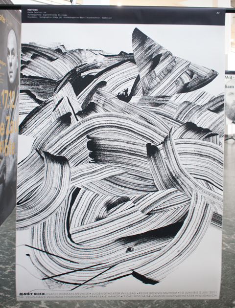
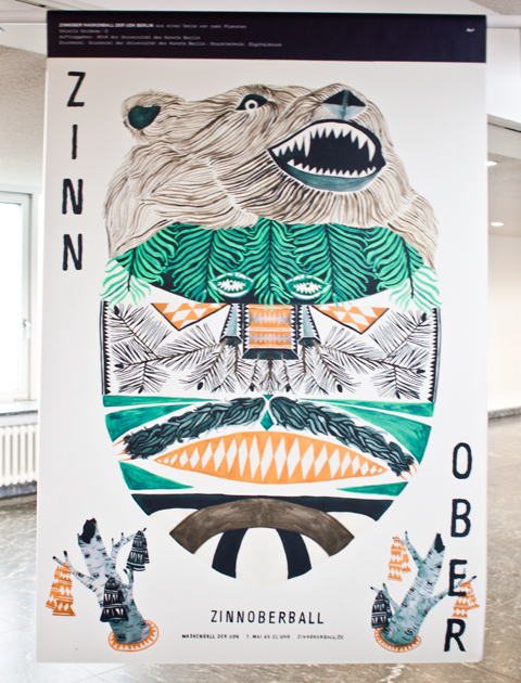
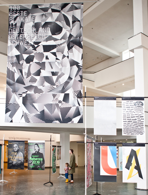
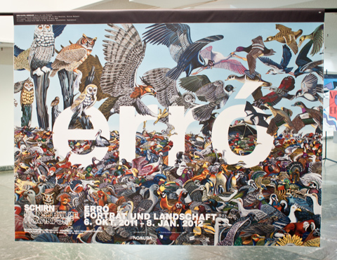
What started out already in 1966 as a competition for the best posters in the GDR has become a dear recurring event: The exhibition »Die 100 besten Plakate des Jahres« (100 Best Posters of the Year) is once more on display at Kulturforum at Potsdamer Platz. 53 posters from Germany, 45 from Switzerland and 2 from Austria were awarded for their outstanding design, whereof 23 of the prize-winning entries are posters designed by students.
We were great fans of the posters by the following designers: Paula Troxler for a Moby Dick theater play, Valeria Gordeew for a masked ball at Udk Berlin, Markwald & Neusitzer for an exhibition of islandic artist erró, Björn-Christian Schiebe for the Museum of Natural Sciences.
Have a look at all winning posters here or check other dates of the travelling exhibition.
OENCE AGAIN…

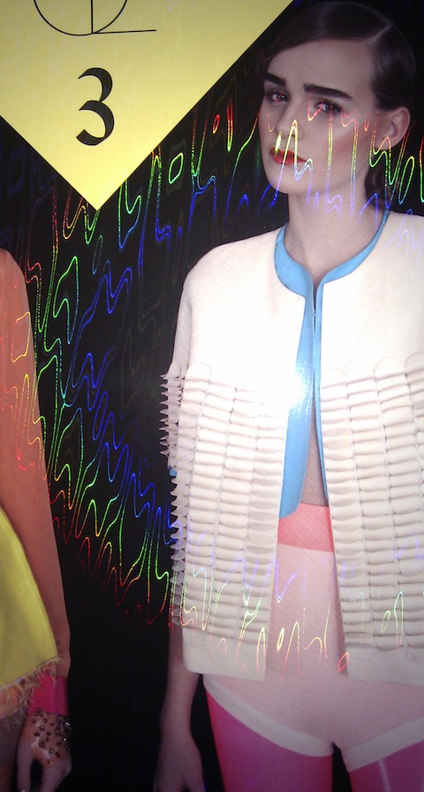
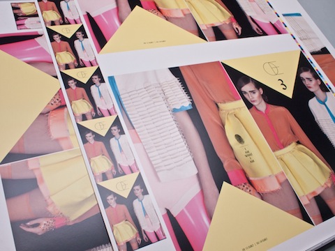
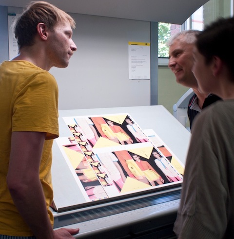
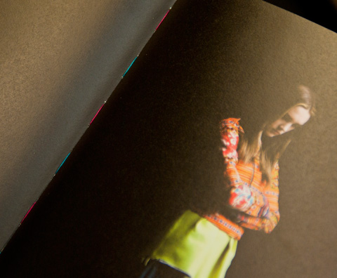
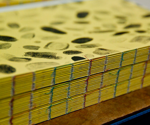
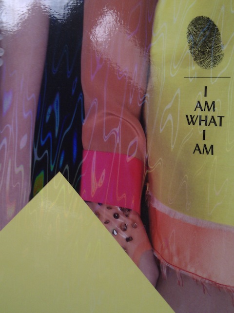
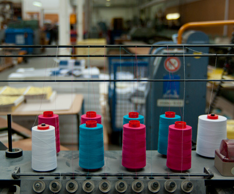
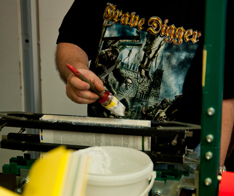
Yes, time is flying and once again we present the next issue of Œ Magazine. Eleven different paper qualities, an open-stitched binding in two colours and as the icing on the cake a holographic diffraction foil on the cover, we can’t ask for more! Surpassing the everyday standards in production, we are happy to work with experts Heenemann Druck and bookbinder Reinhart & Wasser. Production nerds, please enjoy some images of printing, binding and finishing!


FRESH FROM THE PRINTERS

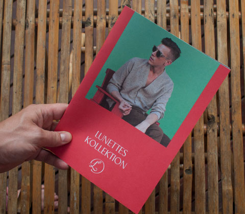
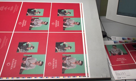
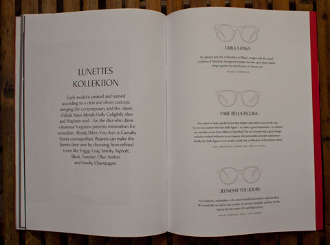
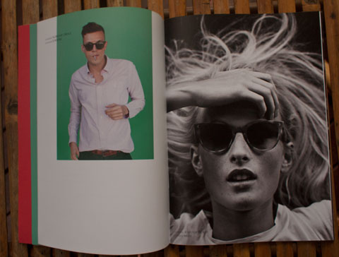
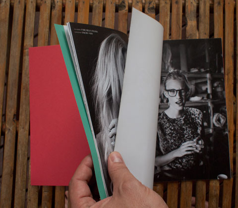
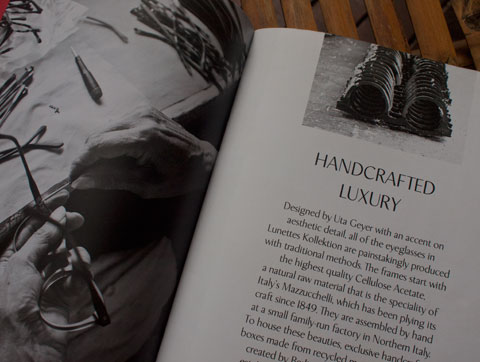
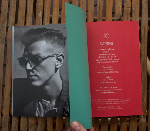
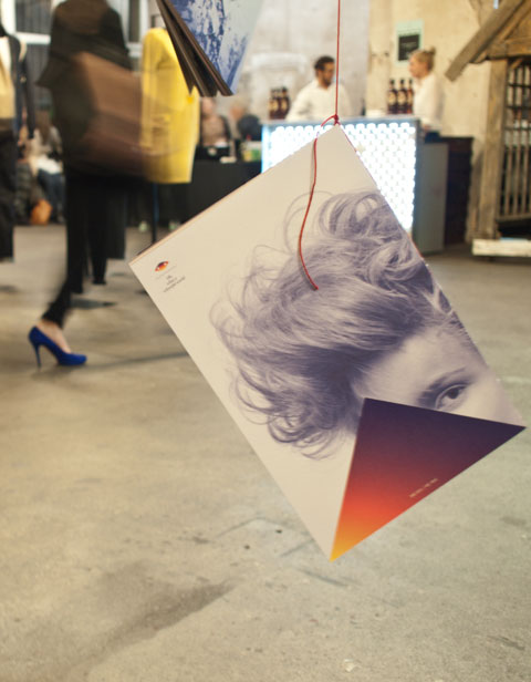
Right in time for Berlin Fashion Week, the lookbook we designed for eyewear label Lunettes Kollektion arrived from the printers. Great glasses, perfect models, beautiful photos shot by David Fischer and styled by Rainer Metz … a welcome dash of colour in Berlin’s grey weather. Check out the new Lunettes collection at the Collect Showroom!


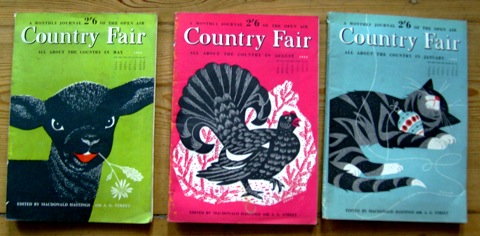
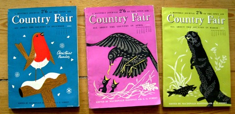
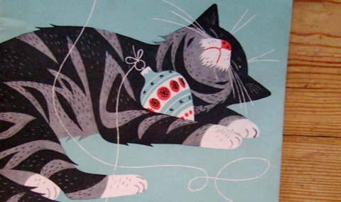
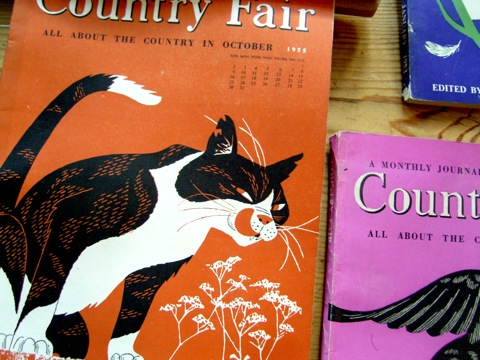
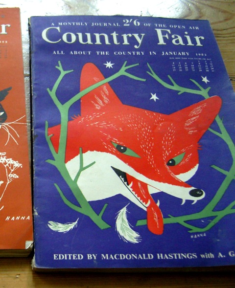
A MONTHLY JOURNAL OF THE OPEN AIR

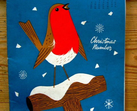
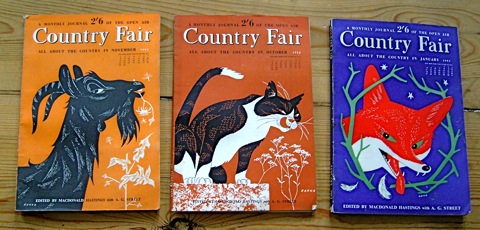
Obviously, I bought these 1950s issues of »Country Fair« because I fell in love with their splendid cover illustrations. But also the magazine’s content is worth mentioning: lessons on how to shoot pheasants, articles on beekeeping and ads for harvesting machinery add up to an interesting reading. The genius behind the striking magazine covers is named John Hanna. He was an Australian who arrived in London in 1947, making his living as a commercial artist and cartoonist there until 1962. During his time in London he created over 50 covers for Country Fair, so the chances are quite good to hunt down some of them on Ebay!

CEL-OE-BRATING!

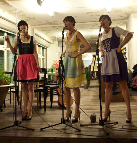
Thanks to everybody who joined to celebrate the release of Π#2 at voo store. And a special thanks to the wonderful Almdudlerdern for yodeling along!

Photos: Christian Smirnow


PRINTING!

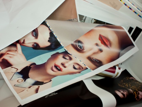
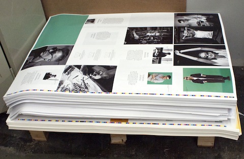
We´re just back from the press proof of the second issue of Œ magazine. It´s printed at printing house Heenemann and we´re very satisfied with what we saw. We can´t wait until it returns from the bookbinder! The images show contributions by Yves Borgwardt, Rachel de Joode, Jette Stolte and Jan Mielke,  for a copy and a list of all contributors check out www.oe-magazine.de. The issue will be out on November 18th.

SHOO-IN

This funny sign is a winner – Bäckmans shoe repair in Stockholm, established in 1922.

PATCHWORK/ TEAMWORK

The website we designed for one of our favourite Berlin fashion designers Sonia Boessert of Boessert/Schorn is now online! The design process was a little accidental: the grey patchwork-pattern in the background originally was composed to visualize a grid system we wanted to lay behind everything and fill with different content and images. It happend that Sonia liked it so much that she wanted it to actually be the design for her website. And as client is king we implemented this idea.

ZWERGENGOLD

This is the CI we developed for and together with our friend Hanna Pordzik, who designs the most amazing things for her new jewellery label. Now we are convinced that Pantone metallic colours can look great on uncoated paper!

THE ROMANTIC GERMAN SHEPHERD

For the second time Corbis awarded a prize for the best cover in corporate publishing media at BCP. We are really happy that our cover for »The Romantic Issue« of Electronic Beats Magazine won this special prize! The image of the romantic German shepherd was shot by Mikael Kennedy. »The cover is the perfect adaption of this issues’ topic romanticism. A strong and exceptional image that intentionally breaks with the viewing habits of its target group, the ‘Digital Natives’.« Yay! Photographer: Mikael Kennedy / Art Direction: Lisa Borges / Editor-in-Chief: Viktoria Pelles / Publisher: Commandante

CHEERS!

It’s been a while since we designed this wine etiquette for our client Achteinhalb. So it was a nice surprise when the final product was delivered by a messenger today.
Achteinhalb has a great collaboration with German vinegrower Tesch and they get their own bottling once in a while. For this 2009 Riesling we finally adapted the new Achteinhalb Corporate Identity to the label. It integrates nicely with the black bottles and of course the honorable Mr. Tesch himself!

MISSION COMPLETED


We´re happy to finally hold it in our hands, Berlin say hello to a new magazine which is dedicated to your vivid and complex fashion scene! Instead of trying to describe what’s going on fashionwise in our capital, we thought we’d better just show it! 10 fashion editorials present different facets with their pure images. Designwise we worked with a lot of paper qualities for the spreads, to enhance their look with a matching feel. A big thanks to Arne who initiated Œ Magazine and all the people who helped us with the financing part. Check out all participating photographers, stylists and hair & make-up artists here. We look forward to working on Œ number 2!

UPDATE: If you want to see ΠMagazine on TV click here!


VISUAL CULTURE ON DISPLAY

This was long overdue: Berlin-based publishing house Gestalten finally opened a shop/exhibition space! But the waiting was worth the while: Situated in Sophie-Gips-Höfe in Mitte, »Gestalten Space« spreads over more than 300 square metres and offers all the great books by Gestalten, covering everything relevant in the international design scene. Besides, you can buy selected products by designers & artists who have been previously published by Gestalten. The gallery space is inaugerated with the exhibition »Cutters Edges« displaying contemporary collages by 50 international artists.

JUDGE A BOOK BY ITS COVER

This weekend, I visited the book fair in Leipzig. Besides presenting an overwhelming amount of literary novelties, the fair is also dedicated to book art. At the yearly exhibition »Best Book Design From All Over The World« arranged by Stiftung Buchkunst you can admire really beautiful books. Great layout, fantastic material choices (especially the Asian people know how to work with paper), sophisticated bindings and other extra details lifted my spirits. 14 books were rewarded, check out the winners here!

PANTHER CLUB

Panther Club is an independant publishing platform from London that produces limited print editions in collaboration with international artists and illustrators. Originally, they started out as a blog covering the field of Graphic Arts and illustration. The blog is a fun source for inspiration where you’ll find a mixture of works by new talents as well as interesting material from past decades.

1. Panther Clubs second print
series »Dionysus, The Ecstasy & Madness«
2+3. Collages by Virginia Echeverria

COLOUR MATTERS

We helped a Berlin-based group of architects with developing their brand and created a corporate identity. We chose to work with colours, something rather unusual amongst architects. We wanted to match the fresh attitude of the architects in question but most importantly we needed a way to make a clear distinction between the members of S3A, who not always act as a group but also as individual service providers.

COLLECTIVE ACTION

Together with more than 30 photographers, stylists, hair & make-up artists and models we were part of a fun project during the last weeks. We took care of the visual concept and layout of »Œ Magazine«, which is a new fashion magazine that focuses on Berlin’s fashion scene. The magazine is non-commercial and is in parts financed by crowdfunding. Check out the project’s campaign video here on WeFund and if you like it, feel free to support a good cause!

Contributing photographers: Amos Fricke, Dirk Merten, Lars Borges, Christoph Schemel, Andreas Lux, Jochen Arndt, Rachel de JoodeClément Martz

Contributing stylists: Christian Stemmler, Christof PostRainer Metz, Åsa Lundström, Brenda Barr, Antje Gohlke, MAVEN, Julian Zigerli

Contributing hair & make-up artists: Alexander Soltermann, Henriette Höft, Manuela Kopp, Miriam Jochims

»A MODERN BOOK FOR MODERN PEOPLE«


The Bonniers Cook Book from 1960 is the Swedish Holy Grail of cooking – everybody’s granny had it. It is a culinary and visual treasure and you can spend a lot of time learning how to modernize your kitchen (to a middle of the 20th century standard), interpreting diagrams about how to blend sauces and admiring table decorations. I even discovered a piece of Rörstrand chinaware I have at home! The cover art is by Bo Lassen, unfortunately I do not know other works by him.